SaaS & AI
SaaS Website Structure: Essential Sections for Clear Product Positioning
A SaaS website must explain what the software does, who it serves, why the problem matters, and what the visitor should do next. Product complexity makes that difficult: teams often lead with internal terminology or a long feature inventory before establishing a clear outcome.
The structure should move from understanding to evaluation. I recommend explaining the product in layers—positioning, outcomes, workflow, capabilities, proof, pricing, and objections—so a visitor can stop at the level of detail they need. This does not guarantee signups or sales, but it makes the product easier to assess.
Gabriel Tognon
Designer, Developer & Template Creator
· 9 min read
Key Takeaways
Lead with audience, problem, outcome, and next action.
Explain outcomes before presenting a dense technical feature list.
Use workflows, use cases, and integrations to make the product concrete.
Support credibility with verifiable proof and transparent product information.
Choose one-page or multi-page architecture based on complexity and buying questions.
Use pricing, FAQs, changelog, and technical content where they help evaluation.
What a SaaS Website Must Communicate
The visitor needs a fast answer to five questions: What is the product? Who is it for? Which problem or outcome does it address? Why should this option be considered? What can I do next? The homepage should answer these before asking someone to interpret the full feature set.
Technical buyers may need architecture, security, integrations, documentation, or changelog information. Business buyers may focus on workflow, adoption, pricing, and outcomes. A good structure creates paths for both without forcing every detail into the hero.
Map these questions to pages and sections before choosing a visual layout. Product, use-case, integration, pricing, security, and documentation routes should exist because the buying process needs them. When the product is simpler, a clear one-page sequence may answer the same questions with less maintenance.
Create a Clear Hero Section
Use a descriptive headline rather than an abstract category claim. Add a supporting line that names the audience, problem, or product approach. Show the product interface or relevant state when it helps people understand what they are evaluating.
Choose a primary CTA that matches the stage: start free, request access, book a demo, view the product, or join a waitlist. A secondary action can support visitors who need proof or explanation, but it should not compete equally with the main path.
Keep the hero honest about availability. A waitlist should not look like an immediate signup, and a sales-led product should not imply self-service access. If different audiences need different actions, route them deliberately rather than presenting several identical buttons with unclear outcomes.
Explain Outcomes Before Technical Features
Outcomes give features a reason to exist. Explain the work the product helps complete, the friction it removes, or the decision it supports before listing implementation details. Keep the language specific and avoid claiming measurable improvements without evidence.
Then connect each outcome to a capability. This creates a clear relationship between buyer needs and product behavior. A feature card should answer why the capability matters, not only name it.
Organize Features and Use Cases
Group features into understandable product areas instead of presenting an undifferentiated grid. Use categories based on workflow stages, user roles, jobs, or product modules. Link to deeper pages when an area needs screenshots, specifications, or documentation.
Use cases explain how different audiences apply the same product. Create separate pages when the message, proof, integrations, or objections differ significantly. Avoid generating thin pages that repeat the homepage with a new industry name.
A useful feature section lets visitors move from summary to detail. Start with the product area, explain the outcome, show the relevant interface, and provide documentation for buyers who need implementation specifics. This layered approach keeps the main page readable without hiding technical depth.
Show the Product Workflow
A workflow section turns a product promise into a sequence. Show what the user connects, creates, reviews, automates, or receives. Use interface visuals and concise steps where the product can be demonstrated accurately.
Do not hide important setup or dependencies. If the product requires integration, configuration, approval, or data preparation, explain the relevant stage. Clarity helps buyers understand adoption without requiring a full sales call.
Use one representative workflow rather than a vague sequence that could describe any product. Label the starting input, the user's main action, the system response, and the result. When several roles participate, show where responsibility changes and which steps are automated.
Present Integrations Clearly
Integrations can be central to a SaaS buying decision, especially for workflow and operational tools. Group them by purpose and distinguish native integrations, APIs, webhooks, imports, exports, and planned connections.
Do not display a logo unless the relationship is accurate. Link to documentation or an integration page when setup details matter. For a focused product, a short compatibility statement may be more useful than a decorative wall of logos.
Build Product Credibility
Use evidence the team can verify: attributed testimonials, customer stories, security information, documentation, product screenshots, public changelog entries, team background, or transparent status information. Match proof to the buyer's concern.
Avoid invented logos, unsupported metrics, and vague authority claims. Early products can build credibility by being specific about the problem, showing the interface, documenting the workflow, and communicating limitations honestly.
Structure the Pricing Section
Pricing should explain plans, billing period, limits, included capabilities, and the next action. Make the comparison readable and define unfamiliar units. If pricing is custom, explain who should contact sales and what information will shape the proposal.
Separate prices from temporary promotions and keep checkout destinations consistent. Enterprise requirements, usage-based billing, trials, refunds, and taxes may need additional explanation. Do not hide critical restrictions in small text.
Test the pricing section with the most difficult comparison, not only the default plan. Long feature names, unavailable capabilities, annual discounts, and custom tiers can create confusing tables on mobile. Give every plan a clear audience and action, and link to detailed billing terms when the section cannot explain them responsibly.
Address Objections With FAQs
Use FAQs for real evaluation questions: setup, integrations, migration, data, security, billing, cancellation, support, access, and product limitations. Keep answers direct and link to documentation when a topic needs more depth.
Do not use an FAQ to repeat marketing claims or create fake search coverage. Each question should remove a genuine uncertainty that does not fit more naturally in the main page.
Use Changelog, Blog, and Technical Content
A changelog can show active product development when entries are accurate and maintained. A blog can explain workflows, use cases, comparisons, and decisions. Technical documentation helps developers and evaluators understand implementation.
These systems require ongoing ownership. Do not launch empty content routes simply because a template includes them. Start with the content the team can maintain and connect relevant articles to product and use-case pages.
Assign each content type a purpose and owner. Changelog entries should describe meaningful product changes, blog posts should answer buyer or user questions, and documentation should support setup and operation. When the same update belongs in several places, link between them instead of publishing slightly different versions that become inconsistent.
Multi-Page Versus One-Page SaaS Websites
The correct architecture depends on product complexity, audience, search strategy, sales process, and available content. Page count alone does not make a website more complete.
Start with the smallest architecture that answers the buying questions, then create separate pages when a topic has distinct content and ownership. A multi-page site with repeated copy creates navigation without depth; a one-page site with overloaded sections creates depth without a usable route structure.
When a Multi-Page Structure Works Better
Use multiple pages when features, use cases, integrations, pricing, documentation, resources, or enterprise requirements need dedicated explanations. Separate routes also create clearer internal links and allow each page to focus on one search or buyer intent.
When a One-Page Structure Is Enough
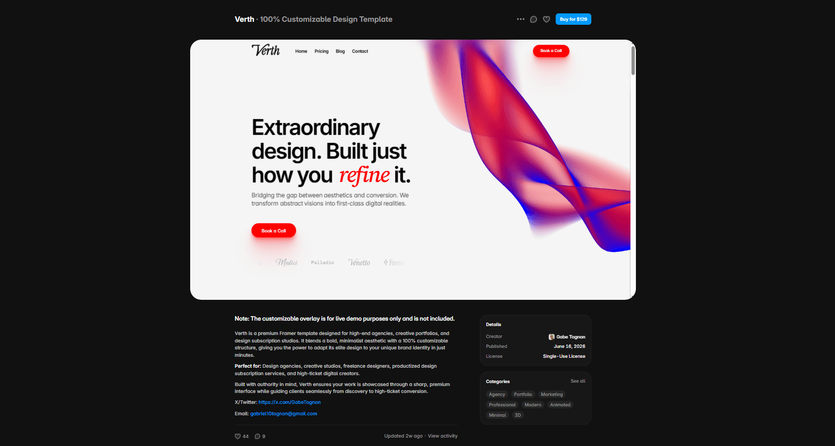
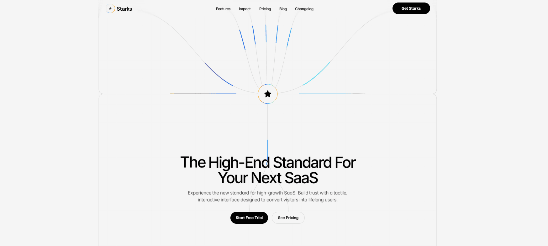
A focused early-stage product or simple workflow may communicate everything on one strong page. Use clear navigation anchors, a logical sequence, and enough proof to support the CTA. Fluxis is related to this one-page workflow-software approach, while Starks supports a broader SaaS content structure.
Recommended SaaS Sitemap
Adapt the sitemap to the real product. The Framer template buying checklist can help evaluate whether a starting template supports these routes and CMS needs.
Define the relationship between these pages before designing them. Feature pages can link to relevant use cases, integrations can point to setup documentation, pricing can answer plan questions through FAQs, and product updates can connect back to the capability they changed. This network helps visitors move through evaluation without returning to the homepage after every question.
Home: positioning, outcomes, workflow, capabilities, proof, and CTA.
Features or product: deeper capability explanation and screenshots.
Use cases: audience-specific problems, workflows, and proof.
Integrations: compatibility, setup paths, and documentation links.
Pricing: plans, limits, billing, and purchase or sales action.
Resources: blog, guides, documentation, or changelog as maintained.
Company and contact: team context, support, sales, or partnership routes.
Legal, privacy, security, status, and 404 pages where required.
Common SaaS Website Mistakes
Fix the communication hierarchy before adding more visual effects. A visitor who understands the product can decide whether to continue. A visitor who only sees polished ambiguity cannot. For a comparison with service businesses, read the agency website structure guide.
Complete the review on the published site. Test signup and demo paths, plan links, documentation, the mobile menu, keyboard focus, analytics, canonical metadata, and indexable routes. A coherent canvas is not enough when checkout, forms, authentication, or external documentation behave differently on the live domain.
Repeat the review with a person who does not use the team's internal vocabulary. Ask them to explain what the product does, who it serves, what happens after the main CTA, and how plans differ. Confusion in those answers usually points to missing communication, not a need for more decorative sections.
Leading with internal terminology instead of a clear product explanation.
Listing features without connecting them to outcomes or workflows.
Using generic interface mockups that do not reveal the product.
Displaying integrations, proof, or metrics that cannot be verified.
Making pricing and plan limits difficult to compare.
Creating empty resource pages without an ownership plan.
Ignoring mobile tables, navigation, FAQs, forms, and accessibility.
Conclusion
A clear SaaS website moves from positioning to product understanding, evaluation, and action. Explain the audience and outcome, show the workflow, organize features and use cases, clarify integrations and pricing, provide credible proof, and answer real objections.
Choose one page or several based on the product's complexity, not a preferred template format. Then test the structure with real content, responsive layouts, accessible interactions, and accurate links before launch. Keep product, pricing, integration, and support information synchronized as the software changes. A clear launch is useful, but ongoing accuracy is what allows the website to remain a reliable part of product evaluation.